Utilities in SalesRender: Client Time, Reminders, and More
At SalesRender, we believe the small things matter.
That’s why we’ve built a set of utilities to make working with orders smoother, smarter, and more human-friendly.

This article covers key utilities that boost productivity. For help setting them up, just reach out to your personal manager.
 Client’s Local Time
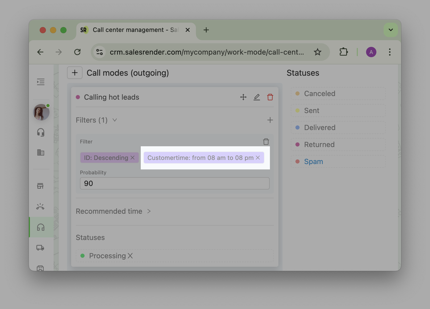
In the orders table, you’ll see a dedicated column showing the client’s local time — essential for call centers working across time zones.
You can even configure the auto-dial mode to avoid calling clients at night or too early in the morning.
 Order Reminders
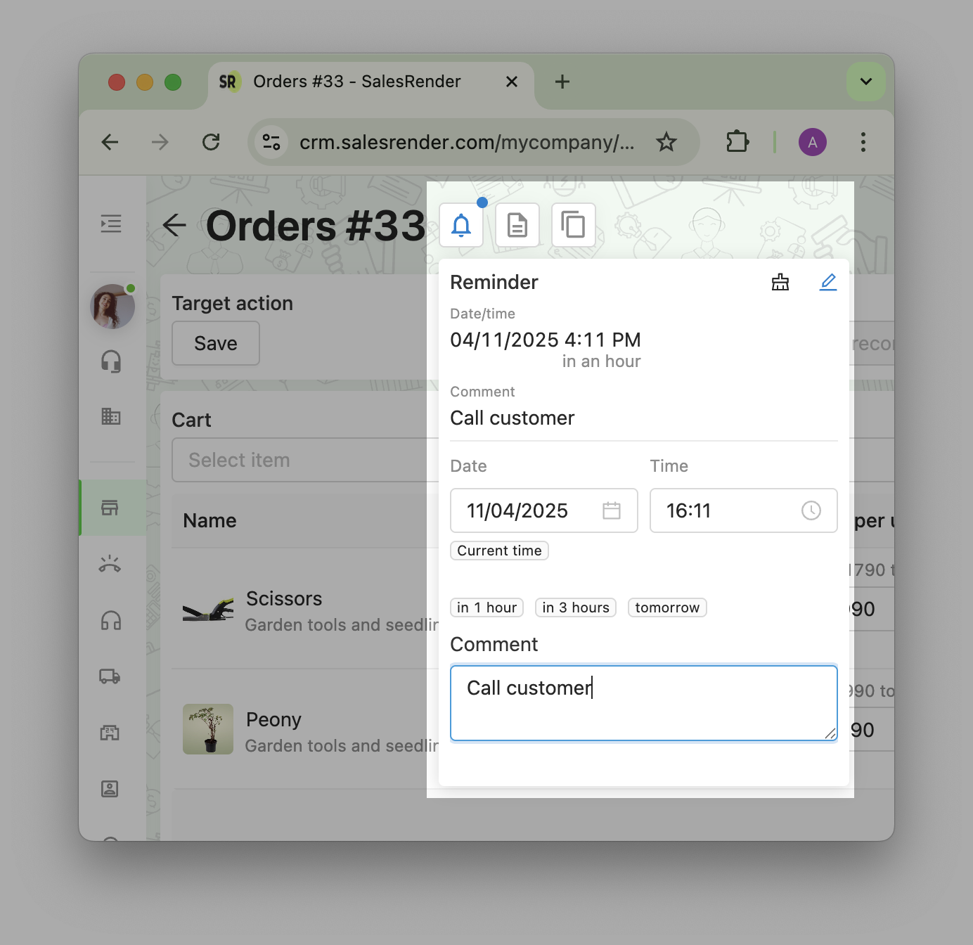
This feature lets you set a reminder with time and a comment right in the order card.
Use it to remember to follow up, send a file, or check details later.
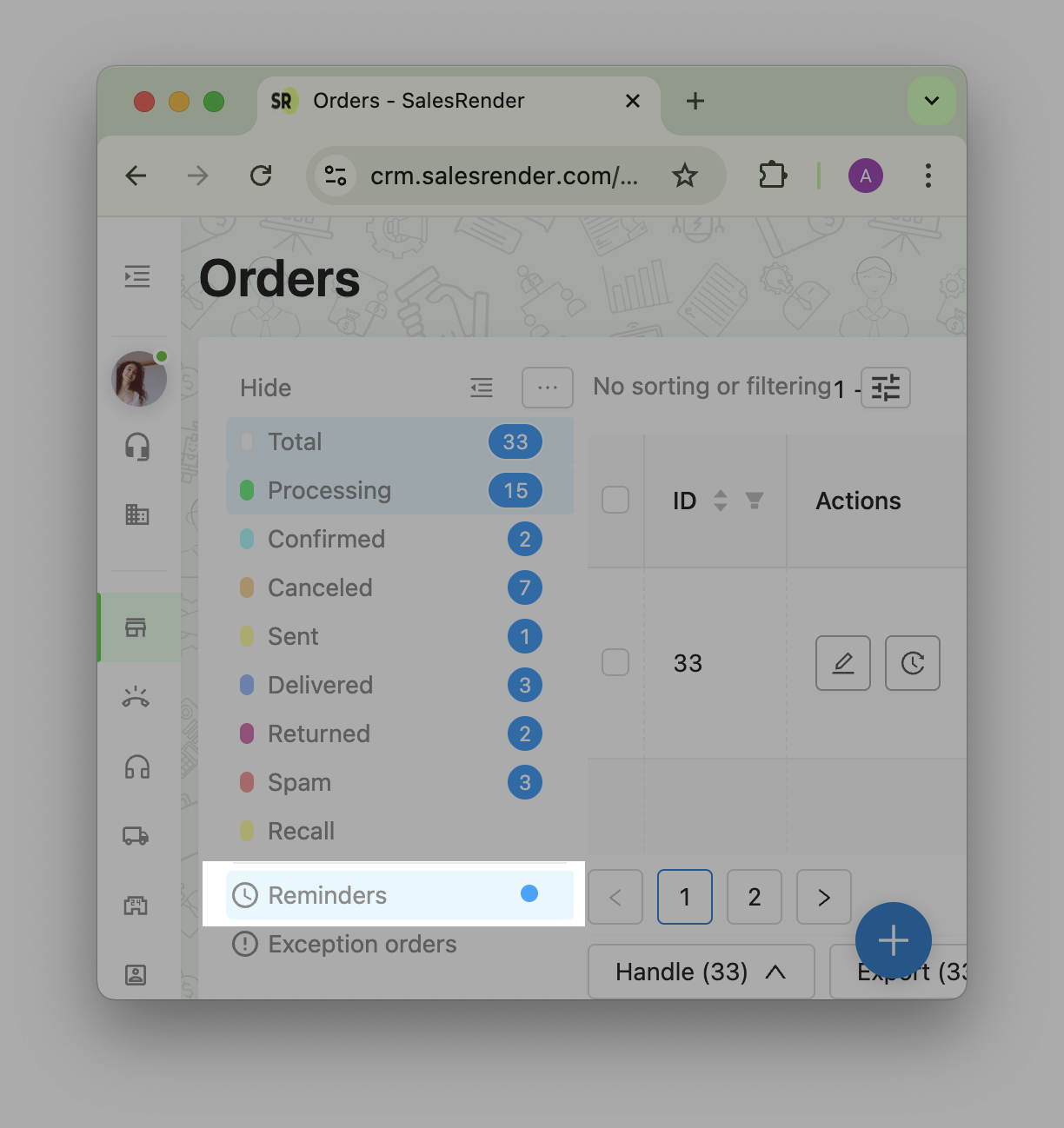
Once the time hits, the order pops up in the dialing mode and also appears in a dedicated "Reminders" tab.
 Order Origin
This utility shows who created the order and from which IP address.
Orders can be created via a user, a plugin, an API call (including affiliate APIs), or from incoming calls via telephony. This info helps track order history and detect fraud.
You’ll find it in the right panel of the order card:
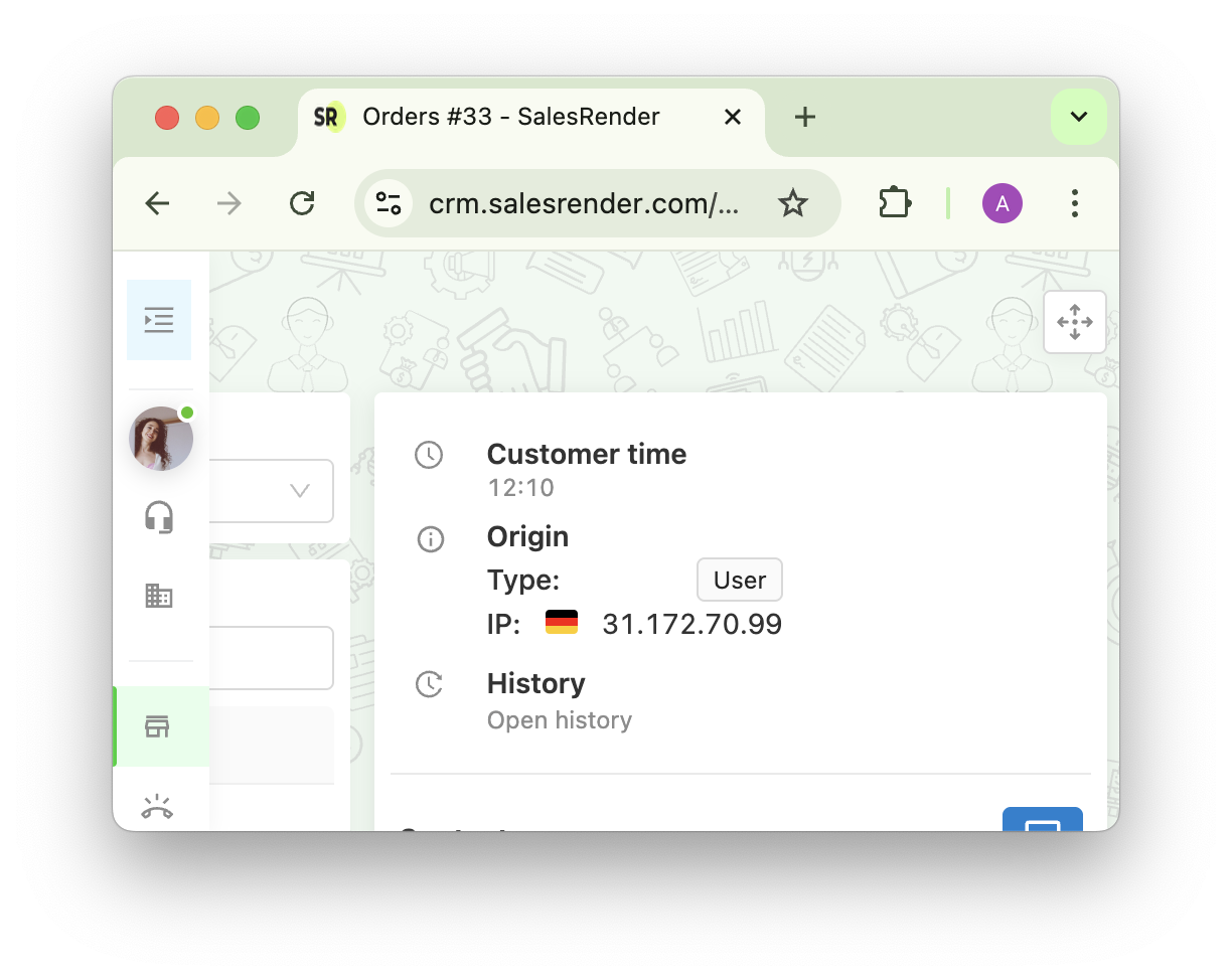
 Table Customization
Every SalesRender table supports:
- Filters
- Sorting
- Column management
- Pagination
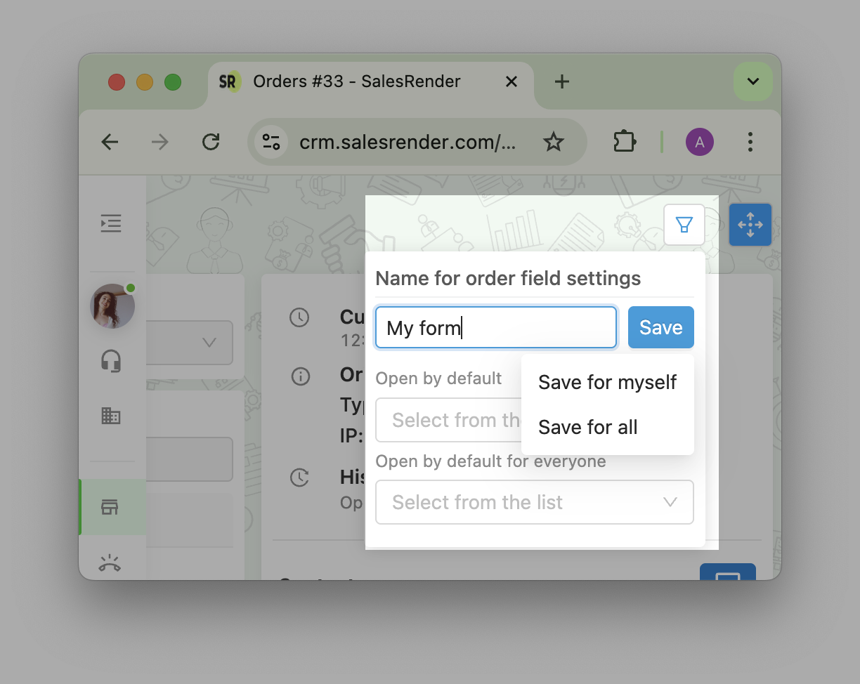
You can save your view setup for personal use or share it across the company.
Learn more in our knowledge base article
 Order Card Configuration
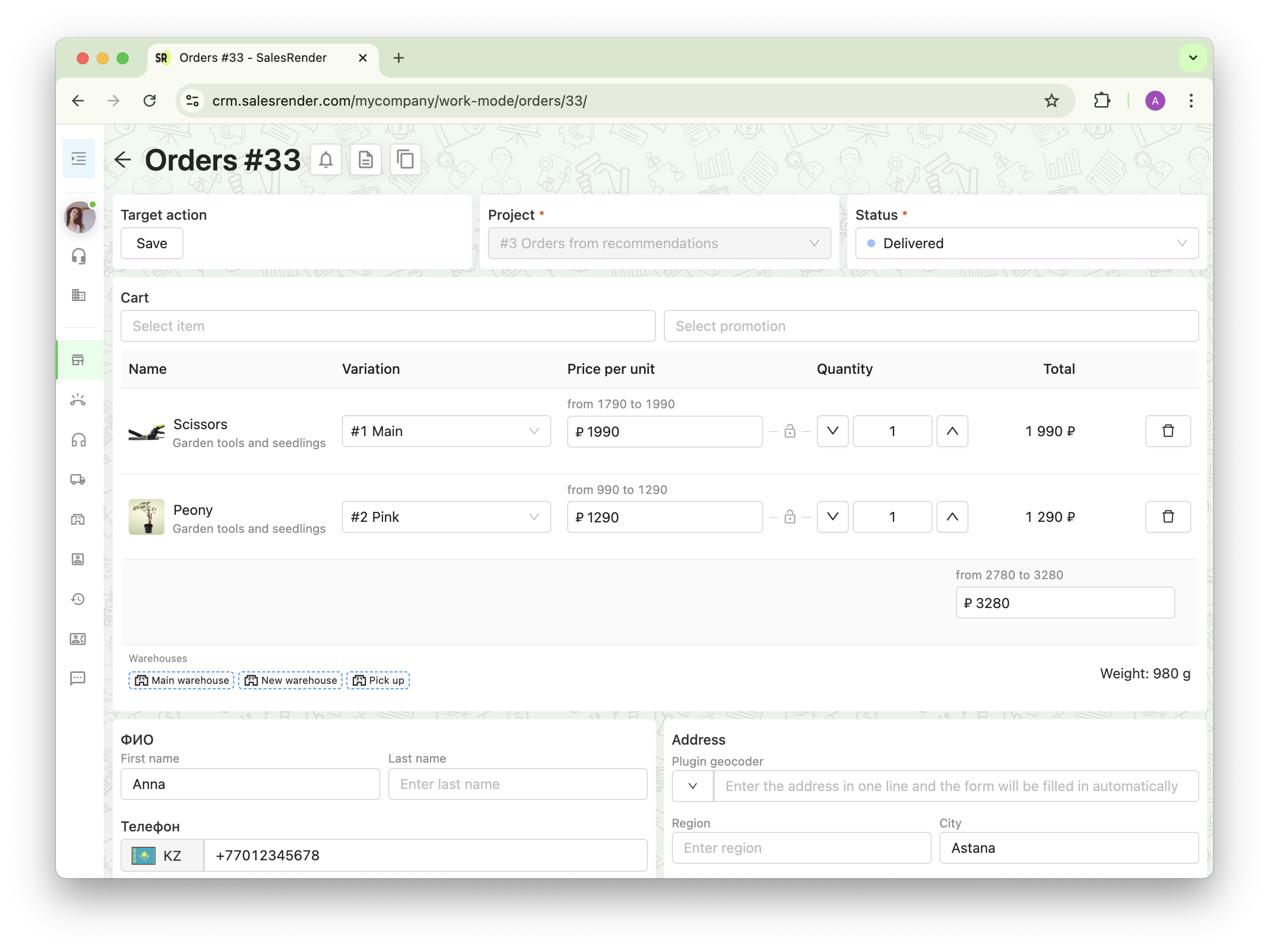
Each order card is made up of blocks (like Cart, Contact Info, Address, etc.).
You can reorder these blocks using the "Move" button and create a structure that fits your team’s workflow or your sales script.
For example:
- Show name and address at the top
- Show cart and delivery options below
- Focus the operator’s attention where it matters
And yes — you can save card layout templates!
Discover even more features on our website salesrender.com
Subscribe to stay up to date Telegram
Contact the СЕО Anna - Telegram
Thank you for being with us